EL MERTO SKATEBOARDS
A Tailored Online Shopping Experience
Click here to test the prototype! (Coming Soon)
Objective
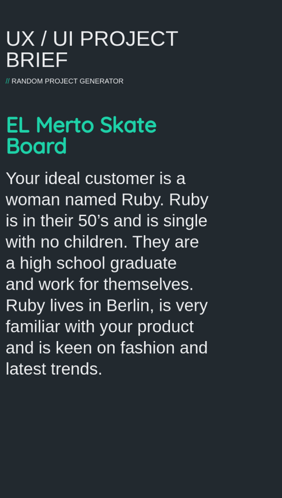
The primary objective of this project was to design an intuitive and engaging mobile shopping experience for EL MERTO SKATEBOARDS, tailored specifically for our ideal customer, Ruby – a trendy, independent woman in her 50s. Every design choice, from the UI elements to the color palette, was made with Ruby’s preferences and needs in mind, ensuring not just usability but a deeply personalized user experience.
Key Tasks Included:
- User Engagement: Create an intuitive interface that captivates and holds the user’s attention, from homepage to checkout.
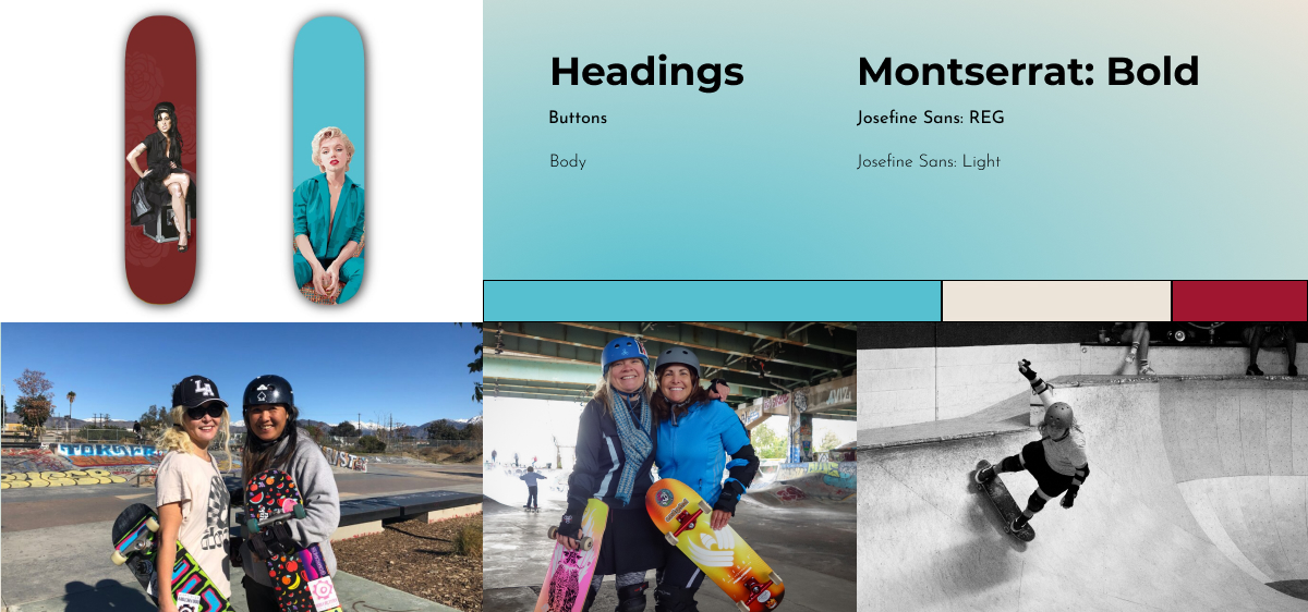
- Visual Appeal: Incorporate aesthetic elements that resonate with the bold and fashionable women in their 50s.
- Functional Efficiency: Ensure a streamlined and efficient shopping process, minimizing steps and maximizing user satisfaction.
- Responsive Design: Adapt the layout and elements to fit various iPhone screen sizes ensuring a seamless experience.
Task flow
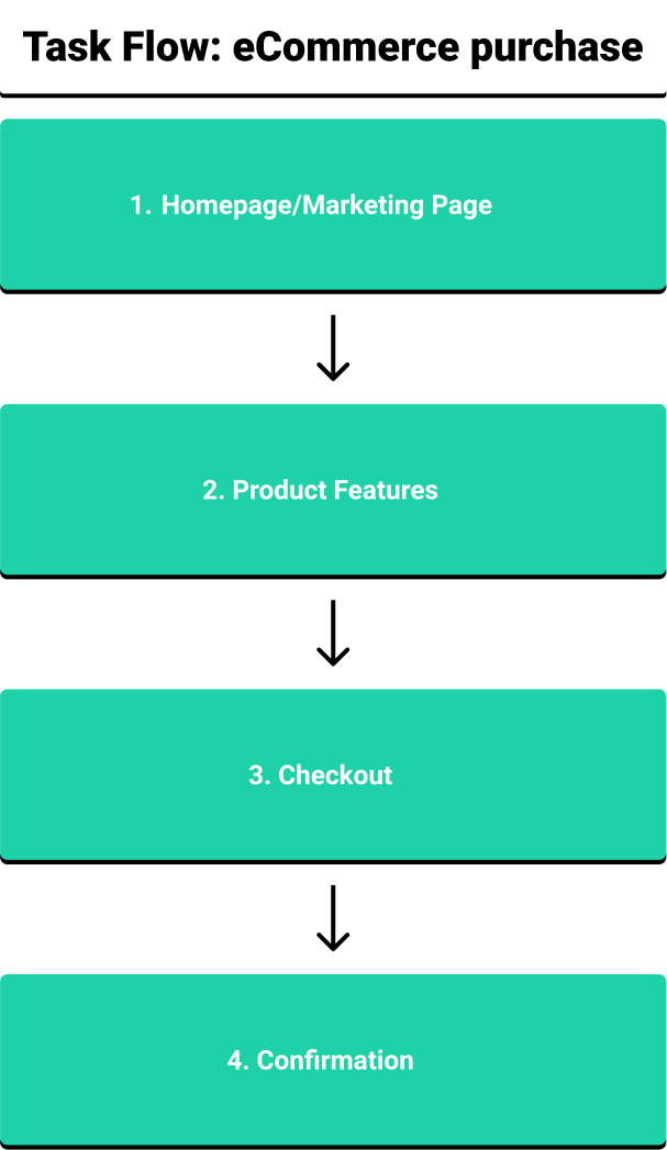
The task flow is designed with a focus on user-centric simplicity and efficiency, guiding the user seamlessly from initial engagement to transaction completion. Here is a step-by-step walkthrough:
Rationale:
- The flow is engineered to be linear and logical, each step a natural progression from the last, ensuring the user remains engaged and confident throughout the journey.
- Visual and textual elements are balanced, ensuring users are informed and enchanted in equal measure – every interaction is a blend of informational and emotional engagement.
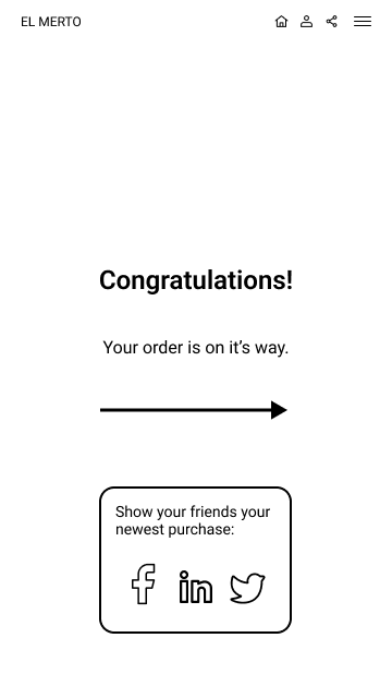
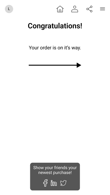
- The final confirmation is not just a transaction acknowledgment but a culmination of a curated shopping experience – swift, satisfying, and elegantly simple.
Final Note:
This task flow epitomizes the marriage of form and function, each step meticulously designed to echo the brand’s ethos while prioritizing user ease, engagement, and satisfaction. It is a journey from visual engagement to tangible ownership, each step imbued with the elegant rebellion that defines EL MERTO SKATEBOARDS.
Moodboard
Wireframes
Color adjustments
In the initial design phase, a saturated blue was employed as a primary color, chosen for its bold and vibrant aesthetic. However, during the evaluation process, it was noted that this shade of blue, although striking, impacted the readability of both white and black text.
To enhance legibility and user experience, a decision was made to refine the color scheme. The blue was transitioned to a dark, almost black, blue-grey tone. This adjustment not only retained the aesthetic appeal but significantly improved text visibility and overall readability.
The text color was also optimized to a white/beige hue, ensuring a harmonious contrast against the darkened background. This meticulous color adaptation underscores our commitment to balancing aesthetic allure with functional excellence, ensuring that every element of the design serves the user’s visual and navigational experience.
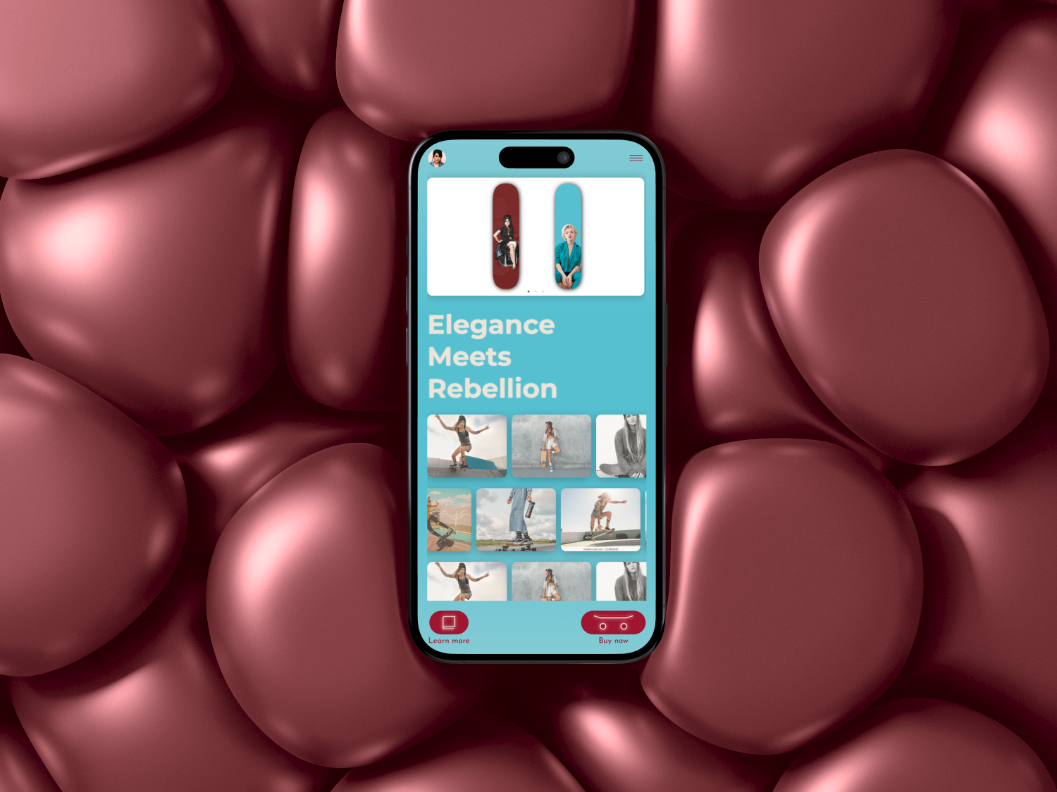
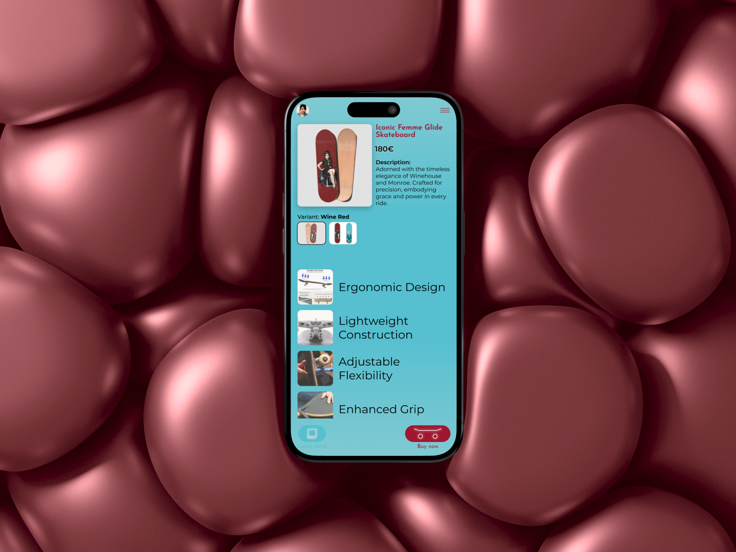
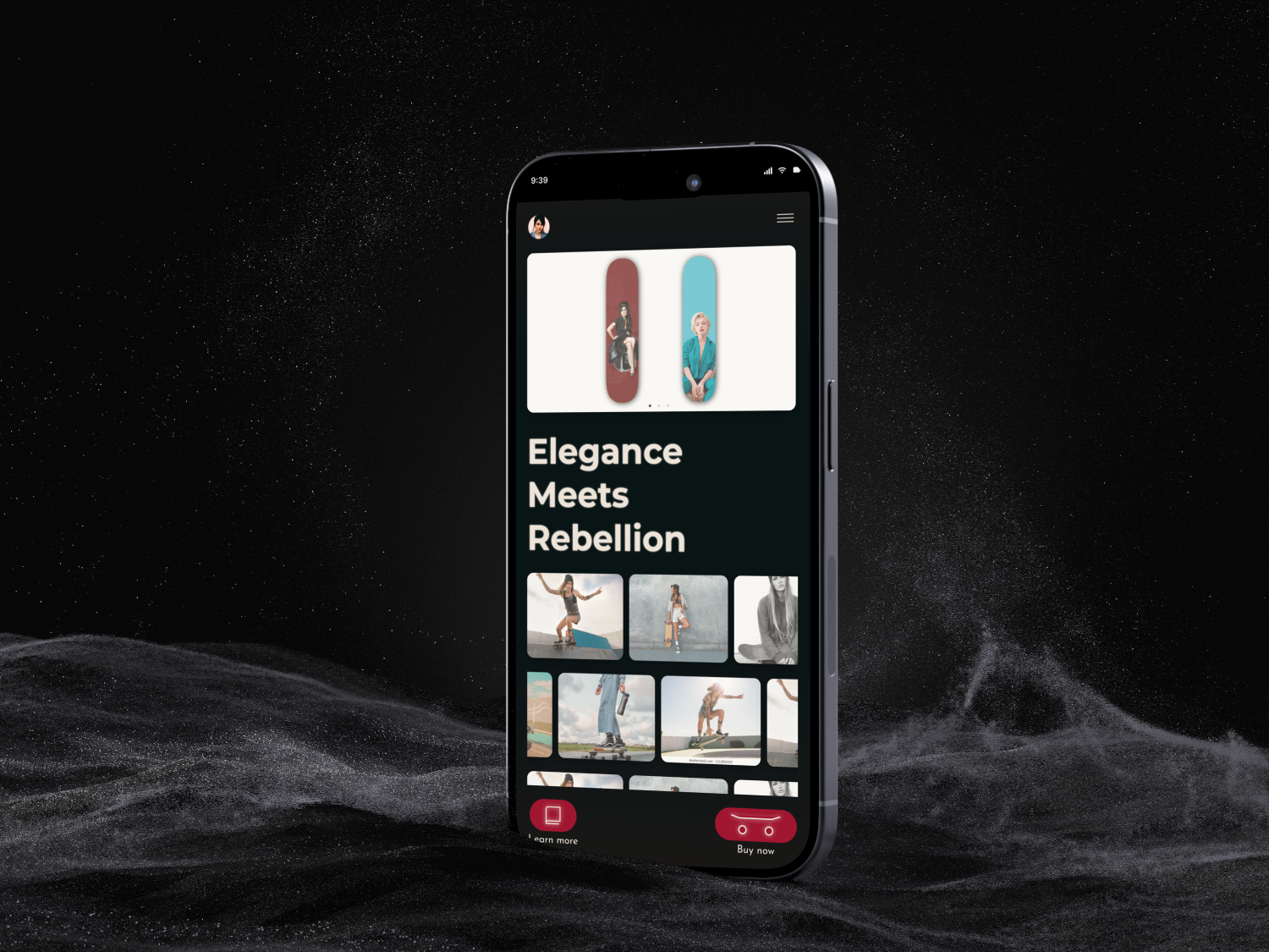
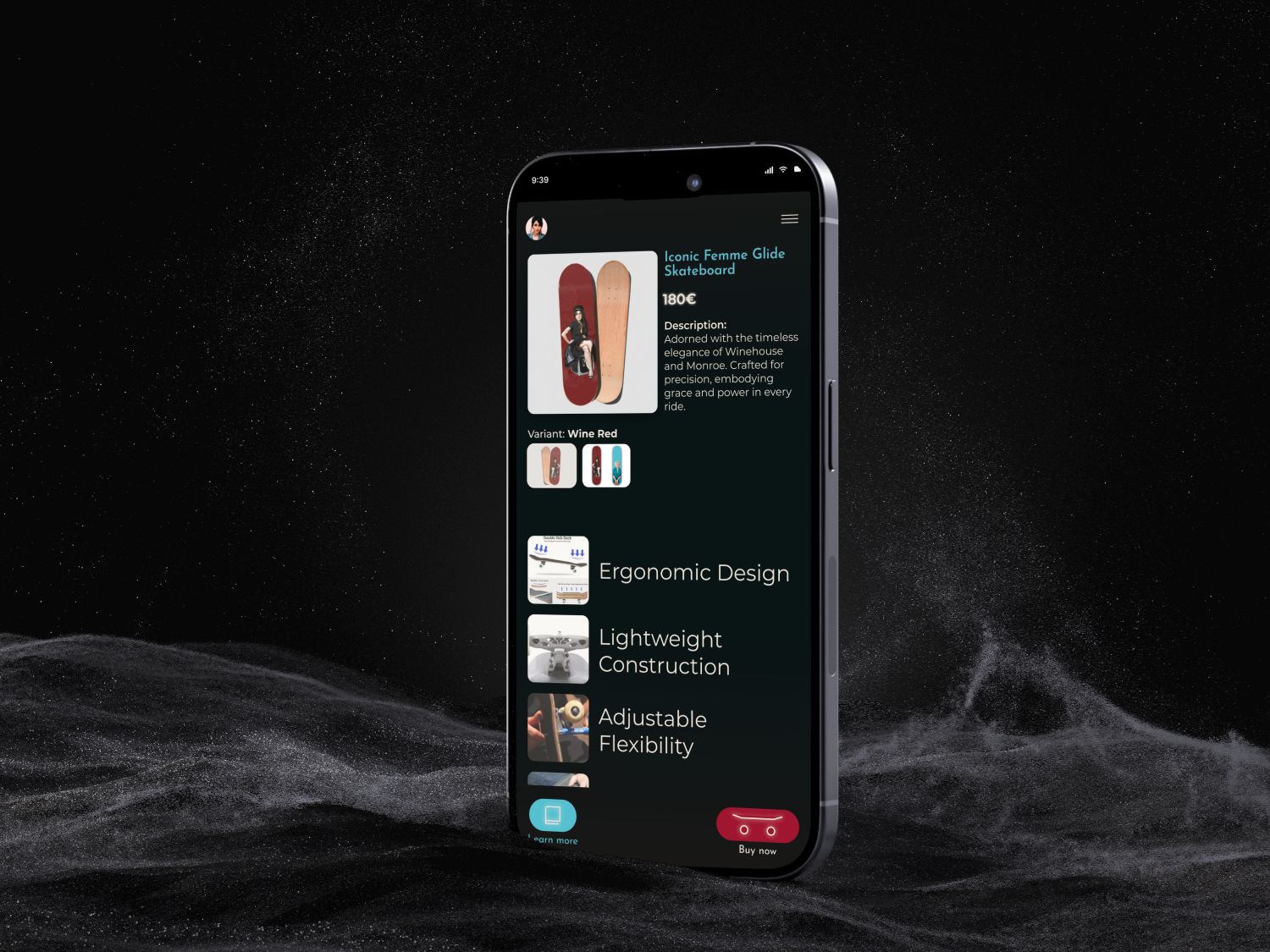
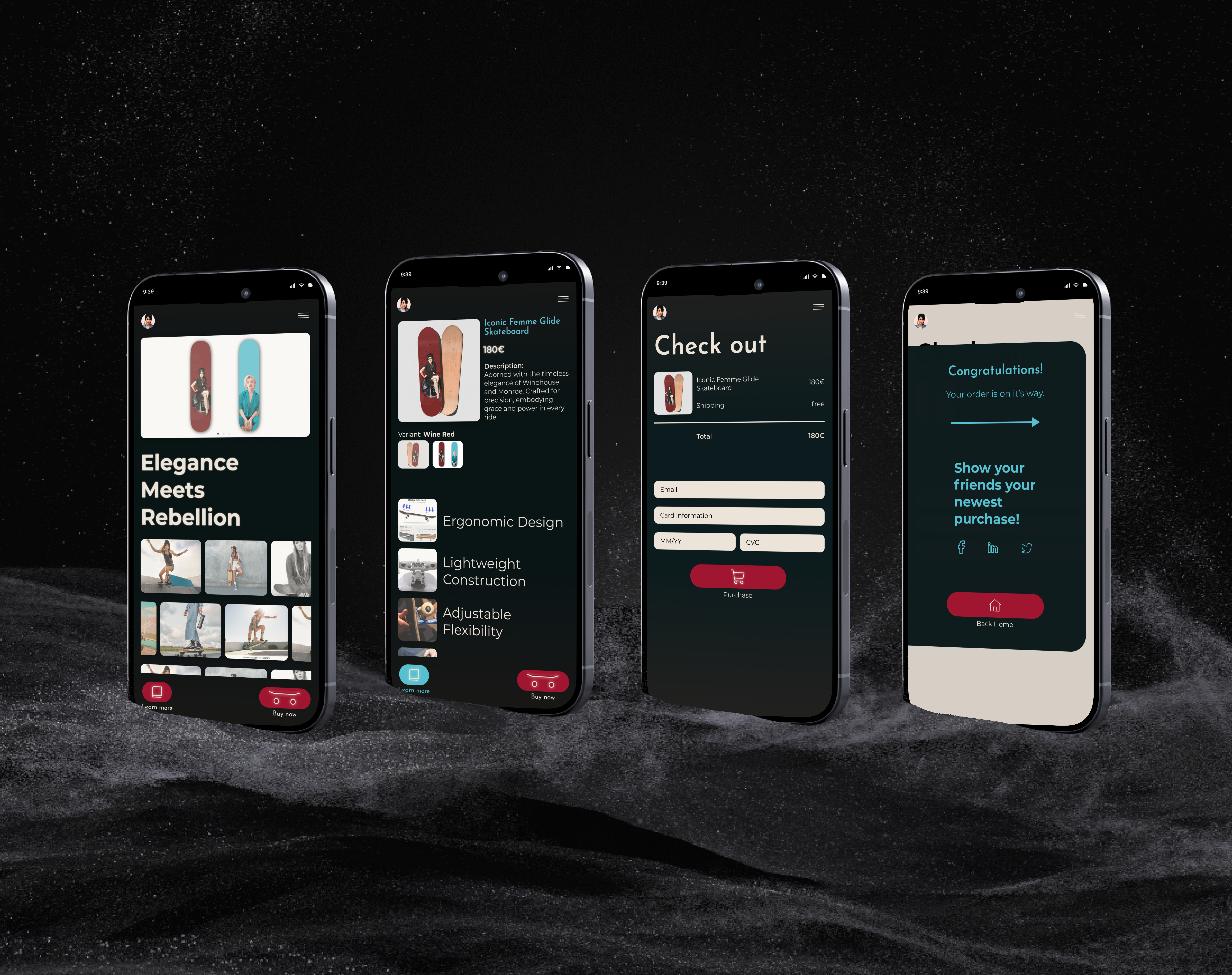
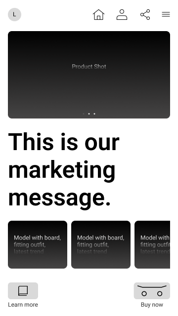
Homepage

- A top bar hosting profile, home, share icons, ensuring swift navigation.
- A captivating full-product shot carousel highlighting the artistic finesse of our skateboards.
- The strategic placement of the marketing message invites immediate engagement.
- Models strategically positioned to project the skateboard’s aesthetic compatibility with the empowered woman in her 50s.
- Action buttons ‘Learn More’ and ‘Buy Now’ prompt user engagement.
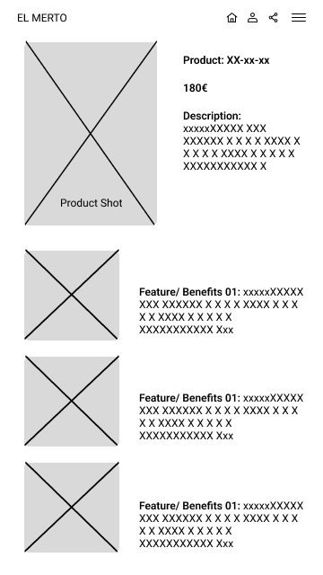
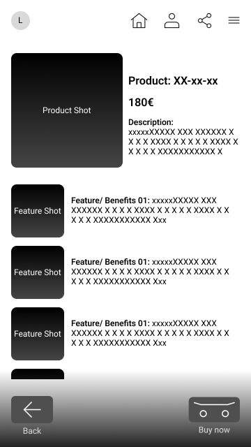
Product feature

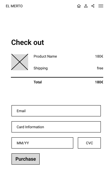
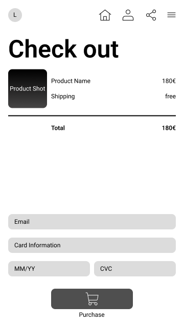
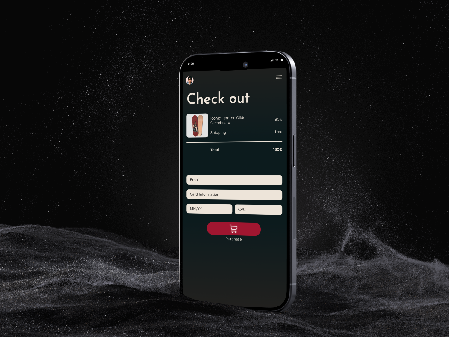
Checkout
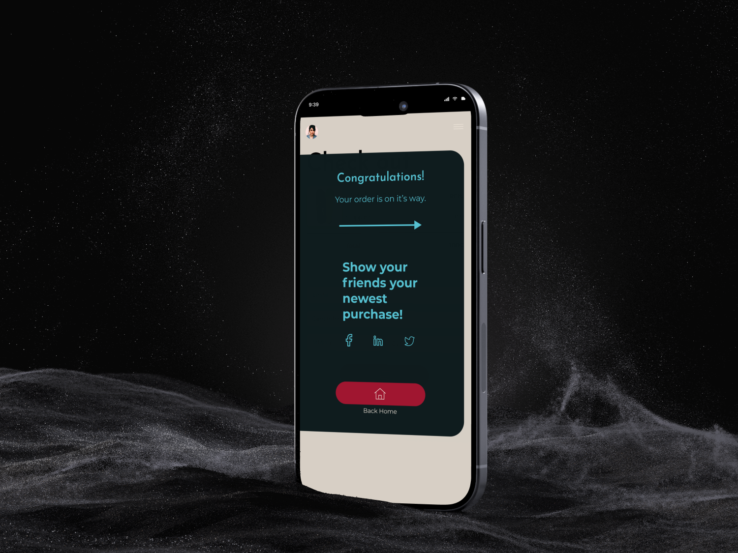
Confirmation
